Painting normal maps, and other Krita tips
Table of contents
I'm a big fan of using software effectively and optimizing my workflows, so over my years using Krita I've spent quite a bit of time digging into its features. In this post I want to talk about how I use this wonderful piece of software and highlight some not-so-obvious bits that have made a difference in my process. I'll do general painting first, hopefully in a way that is useful to beginners, and then indulge in some nerding out about normal maps and how to make them.
As the title suggests, I'll only talk about Krita in this post, but I'd expect most of these features to have analogues in most other painting programs. The latest Krita version at the time of writing was 5.2.6; time-travelling readers on much later or earlier versions may find some differences to their setup.
Part 1: General painting§
Alright, let's get into it. This section is a loosely categorized collection of tips in no particular order.
For more information on everything mentioned here and more, as well as more in-depth tutorials about some general techniques and concepts, I'll refer you to Krita's excellent and extensive documentation.
Settings and shortcuts§
One of the first things I do with any software I intend to spend a lot of time with is familiarize myself with the settings, especially the keyboard shortcuts. I highly recommend customizing the shortcuts to bring all the tools you use frequently close to the left-hand home row for quick and easy access.
A particularly cool part of the shortcuts is the "canvas input settings" submenu. It contains keyboard inputs that interact with your mouse/stylus in some way, such as panning, zooming, or changing the brush size with a gesture, picking the color under your cursor, etc. One of my favorites is the "select top layer" shortcut, which selects the topmost layer that contributes to the pixel under your cursor. This way I can organize my work with layers without having to manually fumble with the layer menu whenever I move to a different part of the image.
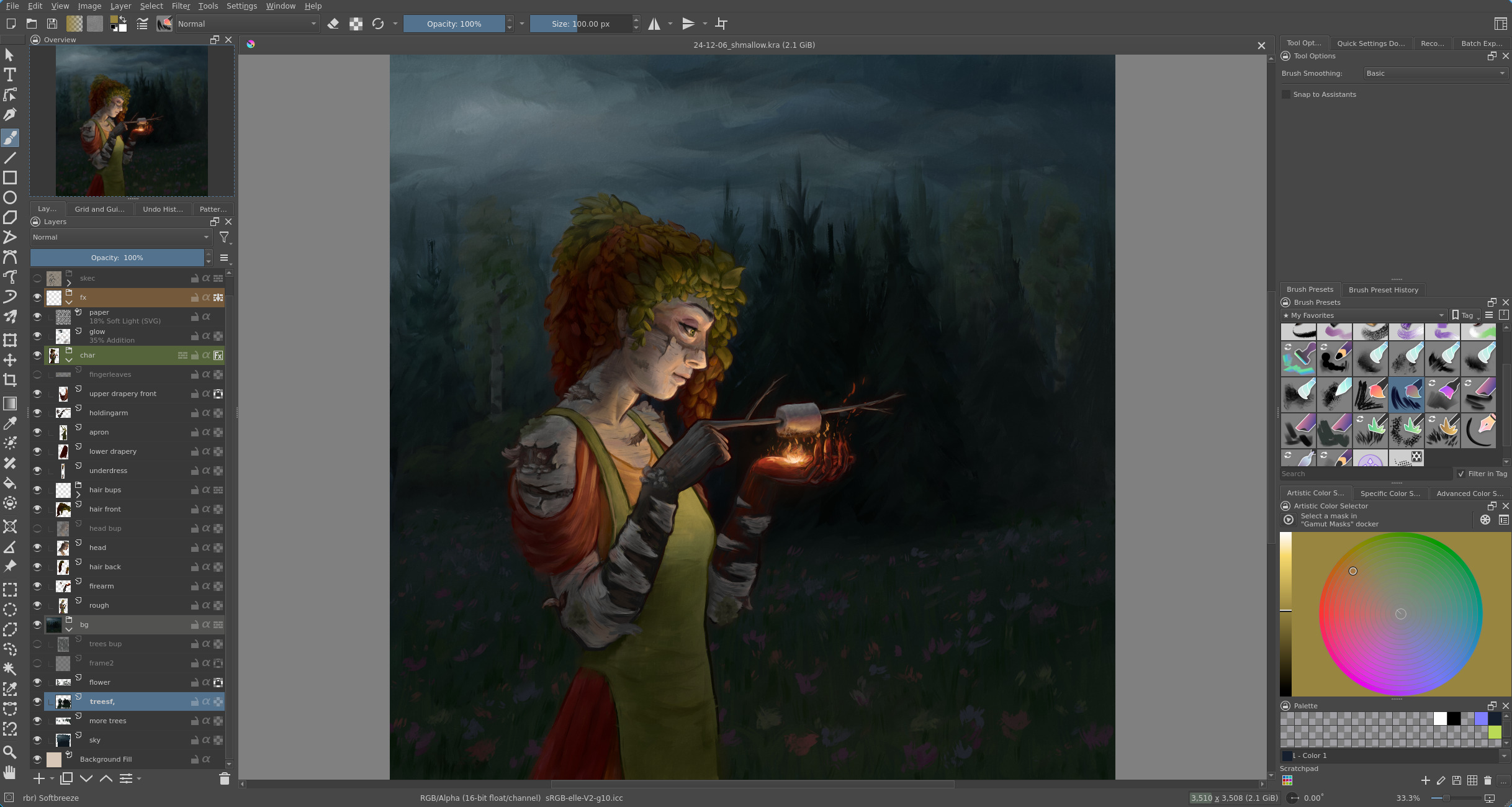
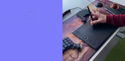
Another menu you should look at is the Dockers dropdown under Settings — there are some nifty things hidden there (more on some of those later). And speaking of dockers (those are all the widgets left and right of the canvas), you can move them around and customize the interface, which can go a long way to improve your workflow. Here's a screenshot of my painting workspace for reference:
I use the color picker and brush selector the most, so those are closest to the bottom right where my stylus hand can reach the most easily.
You can also save and switch between workspace layouts in the menu at the top right corner.
Layers§
Layers have lots of uses, some organizational, others for various effects. I like to organize my layers such that I can easily navigate them with the aforementioned "select top layer" shortcut, which in practice means doing one "part" of the image per layer (whatever that means for the subject) and adding overlay effects last in the process, as these would otherwise be picked up by the shortcut. How many layers depends on how much effort I plan to put into the image and how confident I am about getting it right in one go — layers make it much easier to edit parts of the image without disturbing others, but they also take some effort to maintain.
The effects that layers can do are plentiful. Here's a list of some that I like:
- Layers as stencils: limit where paint can go on a given layer.
There are a few ways to do this:
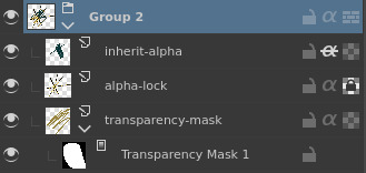
- Alpha lock: you can only paint over whatever is currently opaque on this layer. I use this one the most.
- Transparency mask: a separate mask attached to a layer
that decides which parts of the layer are visible.
Paint on the mask with black and white to control what is shown.
Create with
right click -> Add -> Add Transparency Maskin the layer menu. (tip: if you've made a selection with e.g. the lasso tool and then add a transparency mask, that selection automatically becomes the shape of the mask) - Inherit alpha: only display parts of the layer that are on top of
other layers in the same group.
- Blend modes: alter the way color on a layer interacts with the layers below it.
I'm not a fan of using these for basic things like shading,
but they're great for effects and adjustments.
See the docs for an illustrated list;
some I use a lot are
- Soft light: fairly subtle light effect that tends to saturate colors. I finish most of my works with some airbrushed soft light to give my most important lights an extra push.
- Addition: a physically-plausible way to quickly add stronger lights.
- Multiply: a quick way to darken shadows.
- Fill layers
- A classic trick to add texture at the end of a painting is to add a low-opacity fill layer with a paper or noise texture. This makes color transitions appear less uniform and creates a more "traditional" feeling, especially if using low-texture brushes. Soft light or Overlay is usually a good choice of blend mode to avoid colors getting altered too much.
- Add a black fill layer with the Color blend mode to quickly check how your work looks in grayscale.
- (The effect of a fill layer can also be achieved with a regular layer and the fill tool, but a fill layer has some advantages: it's easier to adjust afterwards and responds automatically to changes in canvas size.)
- Filter layers: a non-destructive way to add a filter (i.e. does not alter any of your existing layers, unlike if applied from the Filter menu), which you can adjust or remove later. I often use this to add a blur over distant parts for a depth-of-field effect. Also comes in handy for normal maps, as we'll see in part 2.
- Vector layers: when you want particularly precise geometric shapes, these can be really nice. Gives you a similar path editing tool to what you'd find in a vector editing program like Inkscape. You can also alpha-inherit a regular layer to one of these to paint on top of the vector shapes.
- Clone layers: make a copy of another layer of group that updates when the original is edited. You can move it around, apply filters using filter layers, and even transform it to a limited extent with a transform mask. My most common use case for these is to duplicate my base pose when I'm sketching clothing designs for characters.
- Layer styles: there are some neat effects here that typically do something around the edges of a layer, such as drop shadows and glows, useful especially for styles with clean graphic shapes. You can apply them to groups of layers too, e.g. to put an outline around a character composed of many layers.
Each of these special types of layer can be created via the little dropdown arrow next to the "new layer" button, or with keyboard shortcuts (which aren't configured by default). Layer styles are in the right-click menu of an individual layer or group, and blend modes are a dropdown at the top of the layer menu.
Brushes§
I don't want to overstate the importance of brushes — it's a common beginner trap to search for good-looking brushes instead of training the fundamentals that will enable you to make any brush look good and to make informed choices about which brushes you want to use. Besides, the default brushes in Krita are great! I used them for years before I went looking for anything else. That being said, I want to call attention to one feature in particular that is missing from the default brush set: tilt.
This is not something every tablet out there can do, unfortunately, so if you're on a budget you may not have access to it. I recently bought a new tablet specifically for this feature (mine is a Wacom Intuos Pro Medium; look for "tilt recognition" or similar in the feature list).
First, shoutout to Rakurri's brush pack, which I found when searching for information on how to make use of tilt. Most of my current go-to brushes are from this pack with minor modifications. There are two main ways tilt is utilized in these brushes. On the one hand, you can use the amount of tilt to change the size of a brush (imagine tilting a pencil to get a wider, softer line), which is great because you can seamlessly work on multiple scales at the same time.
Even more impactful is the ability to control brush rotation with the tilt direction. This enables an entire world of asymmetrical brushes, such as this one mimicking a traditional flat brush.
These are just two of the most prominent examples — tilt angle and direction can be mapped to just about any brush property, so your imagination is the limit if you decide to dive into the brush editor yourself (which I highly recommend you do at some point).
Another way I use tilt (although it's by no means necessary for the basic idea) is in what I call prefab brushes. The idea is that when I want to repeat something small a lot, instead of copying and pasting, I turn it into a brush. This can be done quickly as follows:
- make a new layer
- draw the thing you want to repeat in black
- right-click the layer -> "Select Opaque" (without a selection the brush will contain the whole image)
- go to the Brush Tip section of the brush editor and click the Stamp button
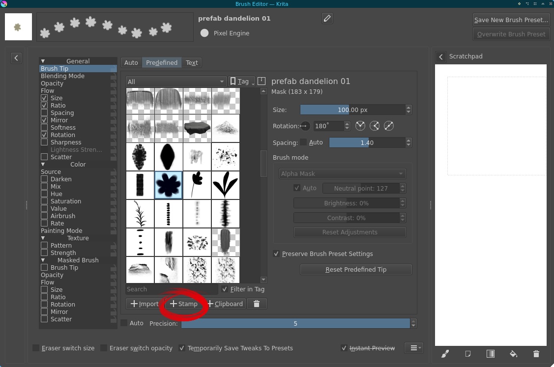
Technically that's all you have to do to make a brush like this, but there are things you can do to make it nicer to use and add some variation.
For one, you can randomly vary the size and rotation of the brush a bit
by adding a Fuzzy Dab component to those features.
The rest of what I do relies on tilt —
I set the Rotation of the brush by tilt direction
(just like that bristle brush earlier),
and for some prefabs I also control the Ratio by tilt angle
such that tilting more squishes the prefab as if in perspective.
Also, for some plants and such things with a clear "up" direction,
I add a Mirror modifier depending on tilt direction
so that when I tilt up, I get the plant facing left,
and when I tilt down, I get it facing right.

Notice how I can now pick whatever color I want! This is both an advantage and a limitation — the whole prefab must be one color to be made into a brush. That's one of the reasons why I only use this technique for small details.
If you want to try this and need more details,
I've included a couple of examples you can build on in this bundle
that you can import into Krita (via Settings -> Manage Resource Libraries).
Color§
Color is another topic where there's no substitute for tons of practice and study, but there are some tools hidden in Krita that I find helpful to make it a little easier. First, let's look at a couple of dockers that aren't in the default layout.
Dockers§
Instead of the default color picker, I use what Krita calls the Artistic Color Selector.
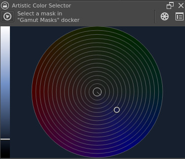
By default, both the wheel and the value slider are divided into discrete segments. I prefer them continuous like this, the settings for which are found in the top right corner of the docker.
Whereas the default color picker has a hue slider and a square plane with saturation and value axes, this one has a value slider and a hue-saturation color wheel. What makes this nice is that it operates in a perceptually uniform color space, meaning that whichever hue and saturation you select on the wheel, the value as perceived by humans is always the one you've picked on the value slider. In contrast, on the default color picker, value varies in a way that depends on hue. This way the artistic color picker makes it easier to control values, which is nice because value is typically the most important form of contrast in a composition. The hue-saturation color wheel also makes it more intuitive to find natural-looking gradients, as the way color shifts in reality is often quite close to a straight line on a wheel like this.
Color theory is a vast topic way outside the scope of this post, but for more on it I recommend Marco Bucci on YouTube.
This is a tradeoff, however, and there are legitimate reasons to prefer the default — because the chroma of a color depends on value and vice versa, I sometimes have a hard time finding a precise shade I'm looking for with the artistic color picker, especially when it's highly saturated. It requires fiddling with the value slider and saturation simultaneously, and it can be easier to get the hue right first and then find the combination of value and saturation as you do with the default color picker.
Another neat docker I use a little less often is the Palette. This one does what it sounds like — you can save colors into it. Nothing much else to say about it, so let's move to the next topic. This one gets a little technical, but it's totally worth understanding a little about.
Linear color space§
Let's talk about transparency, blending, and color spaces. A common issue artists encounter with digital painting is that blending feels "muddy". Specifically, when transparent layers (or brushes) are overlaid on top of one another, you'd intuitively expect it to look like how a stack of transparent sheets looks in reality, but with default settings this is not the case. The result is darker and less saturated, causing that muddy feeling.
The reason for this is called gamma correction, which is needed in the default color space to account for differences in human perception between dark and light values. See this nice article in the Krita docs for more technical details and visual examples; for our purposes here I'll simply state that the physical intuition of transparent sheets is matched when working in a linear sRGB color space (one without gamma correction).
To enable linear color, in either the New Document window
or later via Image -> Convert Image Color Space,
set the Depth field to 16-bit float/channel.
The default 16-bit color profile, sRGB-elle-V2-g10.icc,
has a linear tone response curve.
For reasons covered in the aforementioned article, linear color requires more precision than gamma-corrected does (16 bits per channel, vs. the default 8 bits), so there's a performance tradeoff here — switching to linear color doubles memory usage. The benefit is that it's easier to keep your colors vibrant and bright and your gradients smooth when stacking multiple transparent layers or using transparent brushes such as the airbrush. Give it a try if you have the memory to spare (it can take up a lot — I've crashed my computer several times by filling my 16GB of RAM with a high-resolution 16-bit/channel project and a large undo stack). The difference is subtle but you'll probably feel it.
Sadly changing away from the default color space disables Krita's builtin timelapse recording tool. I really like that feature, but better blending is worth the loss for me.
Filters§
I don't often get my colors the way I want them on my first go. If they're a long way off I'm likely to repaint them entirely, but for smaller adjustments, filters are great. The ones I use most often are Levels to adjust the range/contrast of values and HSV/HSL Adjustment to nudge the overall colors in a specific direction. The Color Adjustment Curves filter can also be nice for more precise control.
Another reminder that it's worth learning the keyboard shortcuts for tools you use often. Each filter has its own shortcut, some of the more common ones already set by default, others configurable.
Other tools§
Now for a few more miscellaneous bits that didn't fit under the other categories.
Selections§
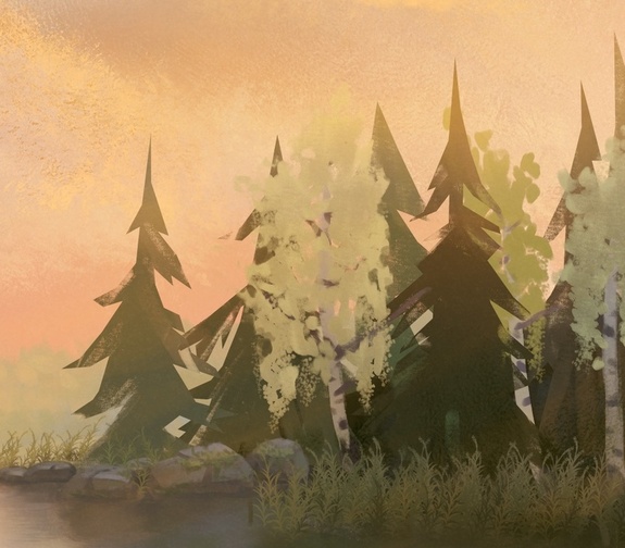
The lasso tool is well known, but a quick word about it nonetheless. Much like the different types of stencil layers mentioned earlier, using selections as stencils while painting can be a lot of fun. Some people do magical things using selections together with soft brushes for edge control, which I'm not great at, but I really like this tool for stylized shapes with texture. For example, the spruce trees in this piece were created by making a shape with the polygon select tool and painting over it with a textured brush.
Some tips for making and modifying selections:
- Hold shift when starting a selection to add it to the previous selection, or alt to cut out of it
- The
Selectdropdown menu contains some nice operations for modifying selections, such as grow and shrink. - Right-clicking a layer or group and selecting
Select Opaquewill select that layer's currently opaque pixels. Combine with, say, growing the selection to make an outline, or use it to create a transparency mask for another layer.
Rulers§
The actual name of this tool is the Assistant Tool,
but it essentially works like a ruler.
It lets you create shapes that your brush will follow when painting,
from simple straight lines to ellipses and even perspective grids.
Just remember to enable Snap to Assistants for the brush tool
in the Tool Options docker.
Multibrush§
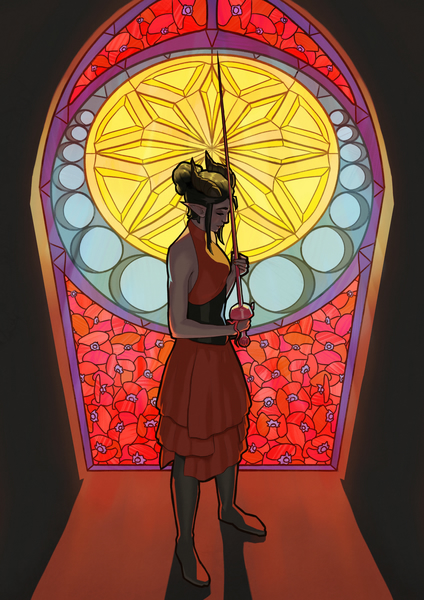
The multibrush lets you easily make several kinds of symmetrical things (mirror, rotational, translational, etc.). You paint in one spot, and it replicates the stroke wherever your chosen symmetry dictates it should be replicated. Very handy for decorations. For instance, the background of this piece was drawn with a mirror-symmetric multibrush (also using rulers, which work with the multibrush too!).
Reference image tool§
The reference image tool lets you attach images to the canvas, keeping your references right there in the document. I don't use this one very often (I prefer a PureRef window on a secondary monitor), but it's particularly useful for color studies — having your references on the same monitor as your painting eliminates any color differences between monitors, and you can use the color picker tool on reference images to check your work.
That's all I can think of as far as tools I use regularly go. There's plenty more cool stuff I haven't gotten around to trying yet, such as colorize masks, and more coming all the time, so I encourage you to explore the menus and docs further yourself. Also, feel free to send me your favorite tips I missed via Mastodon. Oh, and consider contributing some money to Krita's development if you're able — it's an amazing free project that deserves all the support in the world.
Alright, now that the crowd-pleaser part is out of the way, let's get to the extremely nerdy niche I actually wanted to talk about :v) If this is where your interest ends, fair enough; I hope you learned something useful.
Part 2: Normal maps§
A normal map is a 3D graphics technique that adds detail to a polygon surface; specifically, detail that is revealed by lighting. It's an image that tells a 3D surface which direction it's pointing in. Here's a heavily compressed example of the kind of thing I'm doing with them in Velgi:
For more context on how I arrived at this style and set of methods, see this recent post.
What a normal map looks like§
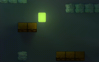
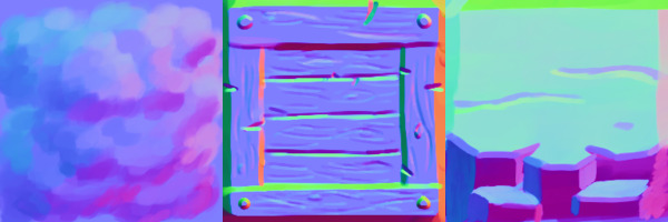
As an example, here are the normal maps of the blocks seen above:
A normal map is an image and can be visualized as such, but the pixels in it do not actually represent colors — the red, green, and blue channels contain the x, y, and z coordinates of vectors pointing out of the surface at any given point.
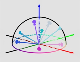
These vectors are restricted to ones with length 1, which significantly limits the range of allowable colors, giving normal maps their distinct color palette.
The usual way 3D artists create normal maps is to sculpt a high-resolution version of their model and "bake" the details into a texture. I'm doing something a little unusual and applying them to 2D drawings instead, so I don't have a 3D model at all, meaning different methods are needed. Hence, painting them in Krita.
How to paint them§
The simplest way to go about this would be to grab a reference normal map of a sphere and pick colors from it, using the regular brushes already present. That would work just fine (here's a video tutorial I saw years ago demonstrating this method), but it wouldn't make a particularly interesting blog post, so let's see if we can do better.
First, if you read the first part and I managed to convince you to join the linear color space gang, you can't do that here — Krita's normal map tools only work correctly in the default gamma-corrected sRGB color space. So be sure to flip back to 8-bit colors when creating a project file containing normal maps.
Now, let's get painting. Krita has a variety of hidden tools to help with this process, including brushes, filters and blend modes.
Brushes§
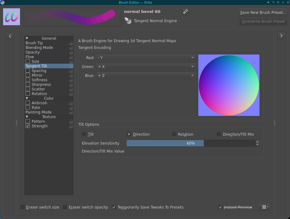
The first and most important tool is the tangent normal brush engine, which gives us a couple of different ways to turn stylus movements directly into normals. Here's what the relevant part of the brush editor looks like:
Tangent-space normals means these normal maps can be applied to any 3D surface and they'll behave like you'd expect (adding detail to the existing surface), as opposed to object-space normals which include information about a specific surface and thus aren't reusable. Here's a cool workflow by Cody Gindy making use of object-space normals in 3D.
The first way to use this brush engine is to determine the normal by stroke direction, which works with any tablet. This is designed for flow maps first and foremost and is a little cumbersome for normal maps by default, but here's a trick I came up with that makes it extremely handy: instead of using the stroke direction directly, have the brush engine rotate the normal so that it faces the stroke direction at a 90 degree angle. Now the brush makes a "bevel" effect when you paint around the edges of a shape.
The previous screenshot of the brush editor shows how to set this up with the Tangent Encoding axis controls.

Notice how it can very conveniently do cracks and similar surface details too!
The black lines are not part of the normal map; they're on a separate layer to guide my painting. Speaking of which, a lineart-based art style is very convenient for this — if you paint without lines it's harder to match the normal map to the painting.
You can control the steepness of the effect with the Elevation Sensitivity slider in the brush editor. That one sadly cannot be modulated with pen pressure or the like, so I have a set of these brushes with different sensitivity settings. Notably, this value should never be higher than around 70% for normals — higher values will turn the normal so far it actually begins to point into the surface, which can create all sorts of strange artifacts. A bit more on that in the next section.
The second way, and in my opinion the more convenient one for most situations, relies on the tilt sensor whose praises I've already sung in part 1. It's very intuitive — point your stylus in the direction you want the normal to face (with the plane of your tablet being the baseline surface), and the brush engine does the rest.
This would be even nicer with a screen tablet, but I prefer a screenless one for ergonomic reasons.
You can also combine all of this with different brush tips to add texture (as I did in the clip above)!
For more detailed reference, I've included a few of these brushes in another bundle.
Layers and filters§
Sometimes it's easier to make an effect one part at a time.
To this end, Krita provides the Combine Normal Map blend mode,
whose output is the sum of rotations caused by two different normal maps.
This is probably easiest to explain with an example —
here's a tree trunk I made by painting the bark pattern on a flat surface first
and then overlaying it onto a simple cylinder.
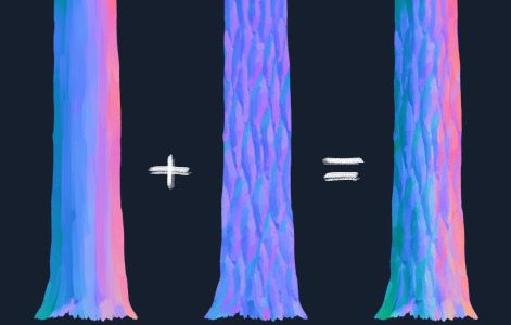
The examples in this section are from an as yet unfinished project. You can think of them as teasers; for me they're reminders that I need to work on this thing to get it done :v)
This blend mode also allows the easy combination of normal maps made with different techniques; for instance, you could take a sphere normal map and distort it to make a rounded overall form, then add finer detail via a painted layer.
Even with these tools you're most likely going to end up with some colors on the canvas
that don't have exactly length 1 and therefore aren't valid normals.
I'm not sure how 3D software typically responds to this,
but just to be sure you get perfectly consistent lighting,
it's a good idea to normalize the map.
Fortunately, Krita has a filter that does just this, called Normalize.
A nice way to use it is to put it on top of your layer hierarchy as a filter layer.
As mentioned in the previous section,
the bevel-type brushes with the elevation sensitivity turned up too high
can rotate normals to face the surface they're supposed to point out of,
potentially causing all sorts of strangeness.
This can also happen when more than one normal map
is combined using the Combine Normal Map blend mode.
This can be hard to avoid while painting,
but I came up with another filter to mitigate the problem:
a Color Adjustment curve can be set up to enforce the z coordinate of the normal to be positive.
I do this with a curve like this applied to the blue channel:
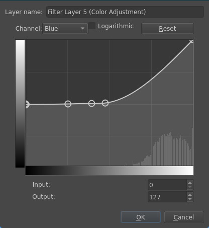
A piecewise linear adjustment curve could do this exactly, but sadly that isn't possible as far as I can tell, so I've approximated the correct curve with a few spline control points instead. If there's a better way to enforce a lower limit for a channel's values, I'd love to hear about it.
What this does is to force all blue channel values to be at least 127 (which is what zero is mapped to in the encoding scheme of the normals), while keeping values above this approximately unchanged. Putting a filter layer like this just below the Normalize filter layer ensures all your normals point out of the surface.
There's one more cool filter I want to mention: Phong Bumpmap.
This one doesn't modify the normal map in a useful way;
instead, it applies a simple lighting model to it
so you can see an approximation of what the results in a 3D engine may look like.
Add as a filter layer on top of your normal map,
activate the "Use Normal map" checkbox in the filter settings,
(optionally) adjust the lights, and you'll see something like this
which you can toggle on and off by changing the filter layer's visibility:

There's also the Height to Normal Map filter, which enables a different workflow where you paint a grayscale height map and convert it to a normal map. This is conceptually a little more intuitive, but I've found it very difficult to get smooth results with it.
Putting it to use§
Now that we've painted a normal map, it would be nice to make use of it somehow. This is a standard technique supported by just about any of the myriad 3D modelling programs out there, and your workflow will not look exactly like mine, but here's a brief overview of what I do as an example.
The first step is to export the normal map to png along with any other textures you're going to use. My project files have several different textures in them (at least a diffuse texture along with the normal map), so this is cumbersome to do manually, but fortunately Krita has a built-in plugin called the Batch Exporter that helps a lot with projects like this — you add instructions to the names of layers you want to export, and the plugin exports all of them in one click. Here's an example layer hierarchy:
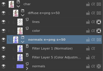
When I click "Export All Layers" in the Batch Exporter docker,
textures are created in a directory hierarchy determined by the layers.
Specifically, the part seen here generates
char/diffuse.png, and char/normals.png for me
and scales them down by 50% from the original size.
See the documentation found in the plugin manager for more options.
This plugin is not on by default. You can activate it via the Python Plugin Manager section in the configuration menu.
Now I move over to Blender, where I import my diffuse texture as a plane, cut out the transparent edges, and add my normal map to the material. For some models I'll then add an armature and animate it.
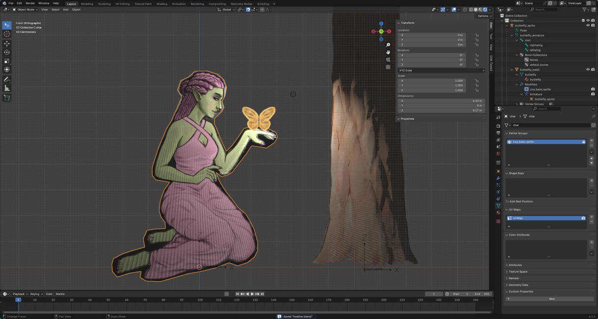
I'm experimenting with the COA Tools Blender plugin to help create and animate these models more effectively. I don't quite know how to use it yet but it seems promising.
Finally, I export the scene to glTF and load it into my custom game engine Starframe, which renders it with some fancy lighting (more on that here).

I'm going to pose and animate that butterfly, I just couldn't be bothered to do so before finishing this post 😅
And that's it! I'm still learning how to make these things look good and how to do so efficiently, but I'm having a lot of fun with it. It's an unusual workflow and I don't expect most readers to go and implement something similar for themselves, but I hope you enjoyed learning about it.