What is local color?
Table of contents
Local color is a concept we all understand intuitively. Roses are red, violets are blue. We perceive things as having colors in some intrinsic sort of way. However, this property of things is not actually a color but something subtly different. Understanding the difference gives us a powerful way to think about color in painting.
I will use math in my explanations because I think it's fun and instructive, but if the symbols go over your head, you might still find it valuable to skim your way to the "implications to painting" section.
Color and local color§
First, let's define what I mean by color. Ultimately, color is a subjective human experience, but one caused something physical and measurable, namely the wavelengths of light that interact with the rods and cones in our eyes. There's a whole sea of radiometric measurements we could get lost in to make this rigorous, but for our purposes the important thing is this: color is characterized by a spectral power distribution, which is simply a function that assigns some nonnegative value to every wavelength of light. Or in math notation (restricted to the approximate visible wavelength spectrum ), For any wavelength , tells us how much that wavelength contributes to the color . As an example, here's the "illuminant spectrum" of a randomly selected lamp from the Lamp Spectral Power Distribution Database:
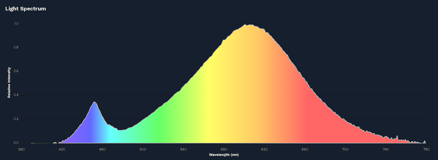
So to put it briefly, what I'm going to call color is a spectrum of light, described by an element of the function space . What its physical units are doesn't matter here.
Not all spectra are actually perceived as different colors. This is known as metamerism, and it's the reason why we can build full-color monitors out of just red, green, and blue lights, or paint with only a few pigments! This isn't important to the interactions characterizing local color though, just a fun fact.
From this description of color it's already clear that local color, as a property of an object and not of light, is somehow a different and secondary thing. We only see color when light reaches our eyes, and yet our intuitive sense for things having their own intrinsic colors is very strong. These are distinct but not so very different things. Both the differences and similarities are subtle but enlightening (no pun intended).
When a light ray hits an object, many things might happen. Two of the most usual are specular (mirror) reflection, wherein the ray bounces off unchanged in one very specific direction, and diffuse (matte) reflection, wherein the ray scatters away in a random direction. The latter case is responsible for most of the light making its way into our eyes, and crucially, light can be absorbed in this process. What's more, the amount of light absorbed depends on wavelength. This is where local color lives.
Consider a ray of light with color undergoing diffuse reflection on a surface and being ejected back out with color . Local color is the process that turns into — in other words, while color is an element of , local color has the type .

On first inspection, these are two very different things! Color is a property of light, local color is a process that modifies light. If local color was just any map , there would be no way to associate it with a specific color, but we do exactly that every time we look at things. Why is this possible? There are two properties of diffuse reflections that lead to this.
First, barring exotic effects like fluorescence, reflection doesn't mix wavelengths. In other words, one wavelength in cannot make a different wavelength appear in . Secondly, for each wavelength, the same proportion of light is always absorbed regardless of the intensity (again barring exotic effects like intensity so high it vaporizes the surface). In other words, local color is a linear map. Taken together, this means a local color 's effect on a color can be expressed as where is a dimensionless scalar coefficient depending only on the wavelength. ( also generally lies in the range , since most surfaces don't emit light, only absorb and reflect it.)
Now we can see how color and local color are similar, and indeed in a certain sense one and the same ("isomorphic" as mathematicians say): if we feed into our local color the color (i.e. perfectly white light at unit intensity, whatever our units are), out comes the color . Local color is thus fully characterized by the color . The inverse is also true: any color can be turned into a local color by
If you've done graphics programming, this should be very familiar: we compute the diffuse reflection by multiplying the local color of the object with the color of the light. Only here we're working with the full spectrum instead of RGB color values. This is also why 3D software calls the material settings defining local color "diffuse color" (or sometimes albedo).
The physical meaning of this is that we can observe the local color of an object by shining a perfectly uniform white light on it from every direction (and ignoring specular reflections). We can also compute local colors from observed ones if we know the color of the incoming light, and as it happens, our brains do this automatically! This is called color constancy, and it's the reason why local color is so intuitive to us. It's a very useful thing for object recognition — when the light changes, we understand that objects we see are still the same.
In summary, color is a property of light, whereas local color is a change in color that occurs during diffuse reflection, described by a linear map. Local color can be identified with a color by illuminating it with a uniform white, hence why we can intuitively ignore the distinction and think about local color as a color.
Implications to painting§
The preceding analysis has two major consequences when we try to replicate the colors of the world on a canvas. One is well known: due to color constancy, it's very difficult to identify colors accurately in absolute terms. Our brains will tend towards seeing things as their local colors, canceling out the effects of colored light. When we paint, we need to fight this tendency. One very useful way to do so is to think in terms of relationships instead of absolutes: this color isn't blue or precisely a lightness of 0.4, it's cooler and darker than the color next to it. This kind of relative thinking is especially crucial when working with a limited palette that can't reproduce the absolute values of some colors at all.
Technically, we're always working with a limited palette — every medium has a limited "dynamic range", meaning we can't go brighter than a certain white or darker than a certain black. This is managed with techniques of "exposure" and "tonemapping". But I digress.
Less often discussed is what the difference between color and local color should imply to our painting process. The important point is this: color is a property of light. Local color only modifies the light that is there. Therefore, when considering the colors of a scene we're painting, we should think about the light first, and local color as a (subtracting) modification to it! This is a reversal of the perhaps more intuitive, and in my experience more common, process of starting with local colors and modifying them according to the light. It's not that this process is strictly wrong in any way — indeed these two approaches are isomorphic in the same way color and local color are — but if we want rich, colorful lighting, starting with local color makes the whole process needlessly difficult.
To illustrate the difference between these two methods, I've applied both to coloring this bundle of flowers under an exaggeratedly blue nighttime light, overdoing the difference for dramatic effect:
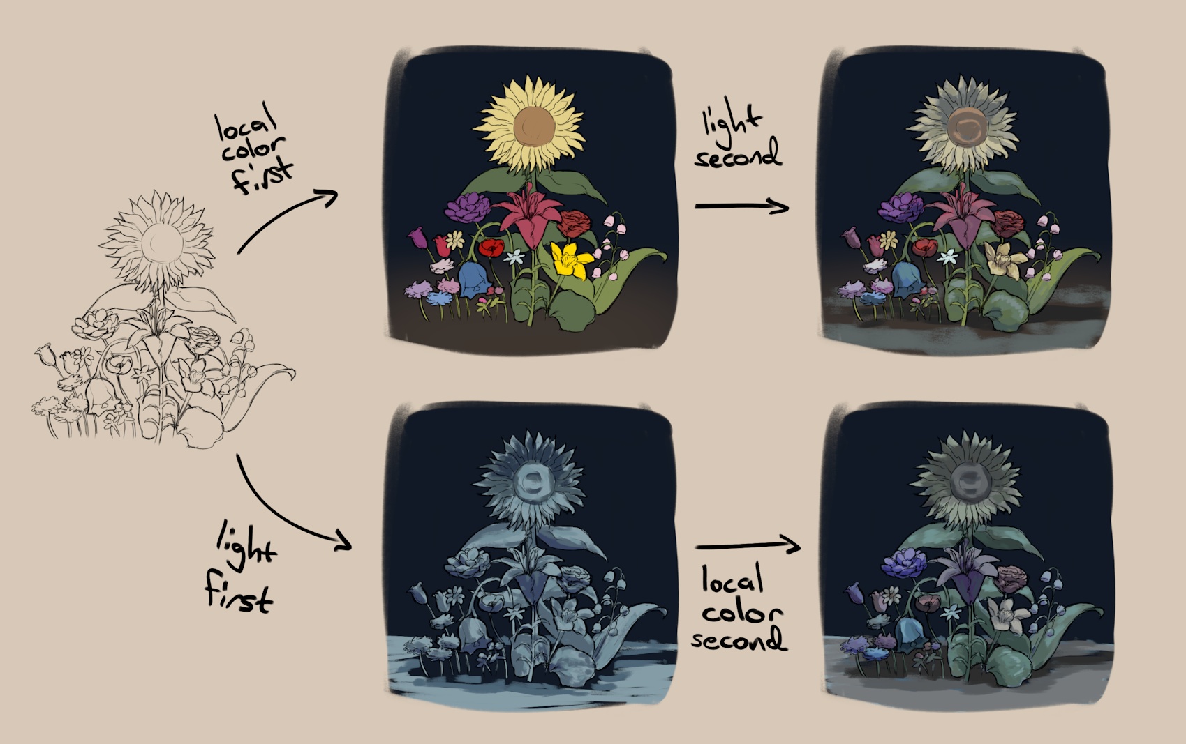
In the first case, I started with local colors and made small adjustments towards the light color, giving the impression that the light is only very weakly colored. These adjustments would have to be very large and difficult to control to arrive at the second, much more cohesive result, which was obtained quite effortlessly by starting from the light and nudging it in the directions of the local colors.
I don't usually do this in separate steps like this — I keep the color of the light in my head and adjust it towards local color all in one go, but I recommend trying this two-step process as an exercise if you've never painted like this.
One more interesting thing to notice is how this pertains to the difference between digital and traditional art. In digital art, we're defining colors directly, to be beamed out of a monitor into our eyes. In traditional art, on the other hand, it's the local color of pigment that makes a picture! This is why it's good to paint under daylight or a lamp with as close to a full-white spectrum as possible (I should really get a better lamp myself...) — that's the kind of light where we see the local color accurately. Otherwise, changing the lighting conditions might end up significantly changing the look of our painting.
Further reading/viewing§
Besides all the Wikipedia links I've peppered throughout this post, here's some more related cool stuff I recommend you check out.
I first encountered this "light-first" approach to color on Jeremy Vickery's YouTube channel Lighting Mentor. The channel is full of great advice on color, light, and art in general. He also has some nice guest appearances on Proko.
It's worth noting that all of this only applies to diffusely reflective materials. In fact, metals don't do diffuse reflection and thus don't have local color at all! To master metals, as well as to complete our understanding of most non-metal materials (called dielectrics), we also need to understand specular reflection. Here's a video by Marco Bucci, another great teacher of color theory, explaining this.
For those interested in a deeper look at the science of radiometry, especially in the context of computer graphics, I highly recommend Christoph Peters's blog Moments in Graphics. Their two-parter on radiometry and photometry is the most accessible introduction to the topic I've seen, and their series on spectral rendering features a nice explanation of spectra as well as fascinating examples of where the usual RGB color model fails at realistic shading.